Corporate HQ
Monk Development, Inc.
14488 Old Stage Road
Lenoir City, TN 37772
(877) 452-0015 Toll-Free
Support
Hours
8:00am - 5:00pm
Mon - Fri (CST)
Email
Submit a Request
Phone
1 (877) 452-0015 x2
Learn more about our support services.

Monk Development, Inc.
14488 Old Stage Road
Lenoir City, TN 37772
(877) 452-0015 Toll-Free
Hours
8:00am - 5:00pm
Mon - Fri (CST)
Email
Submit a Request
Phone
1 (877) 452-0015 x2
Learn more about our support services.
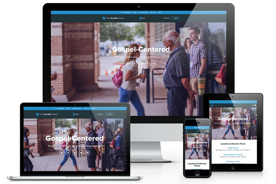
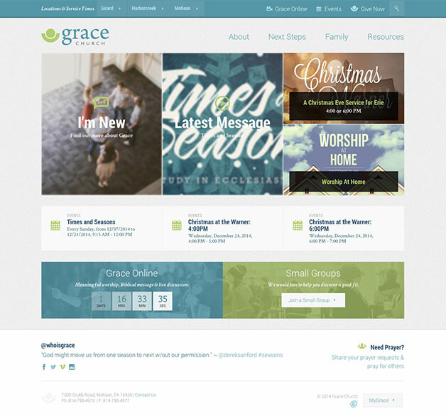
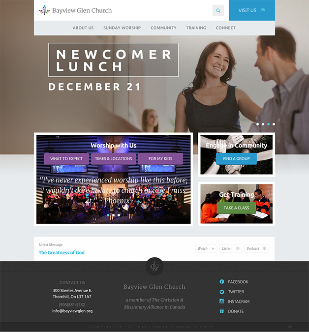
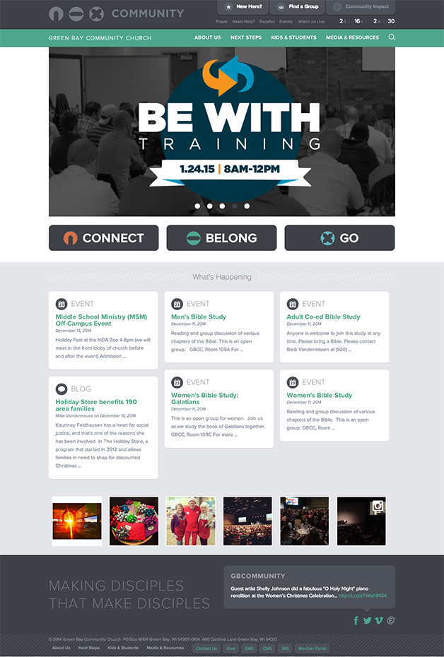
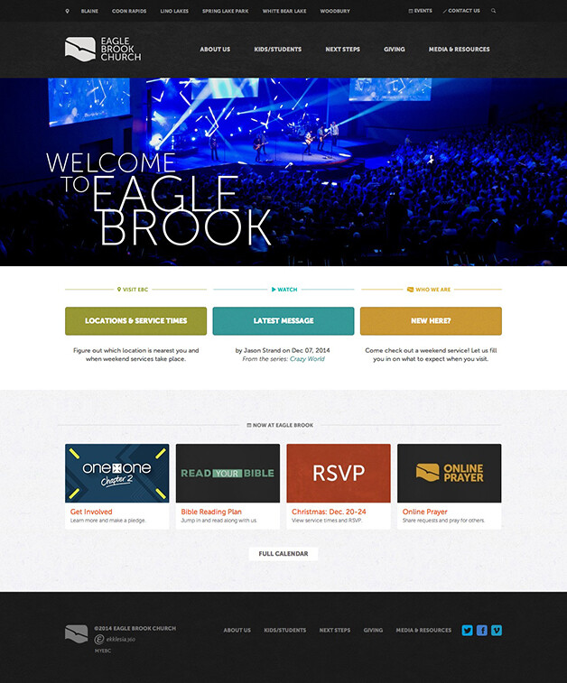
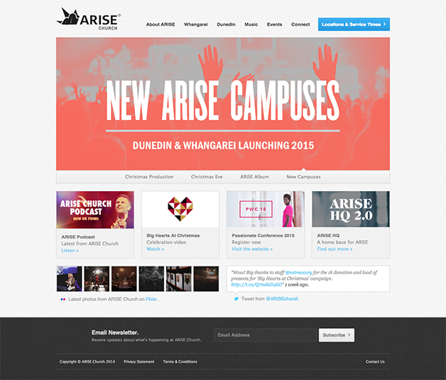
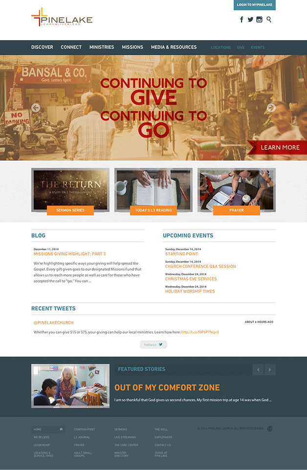
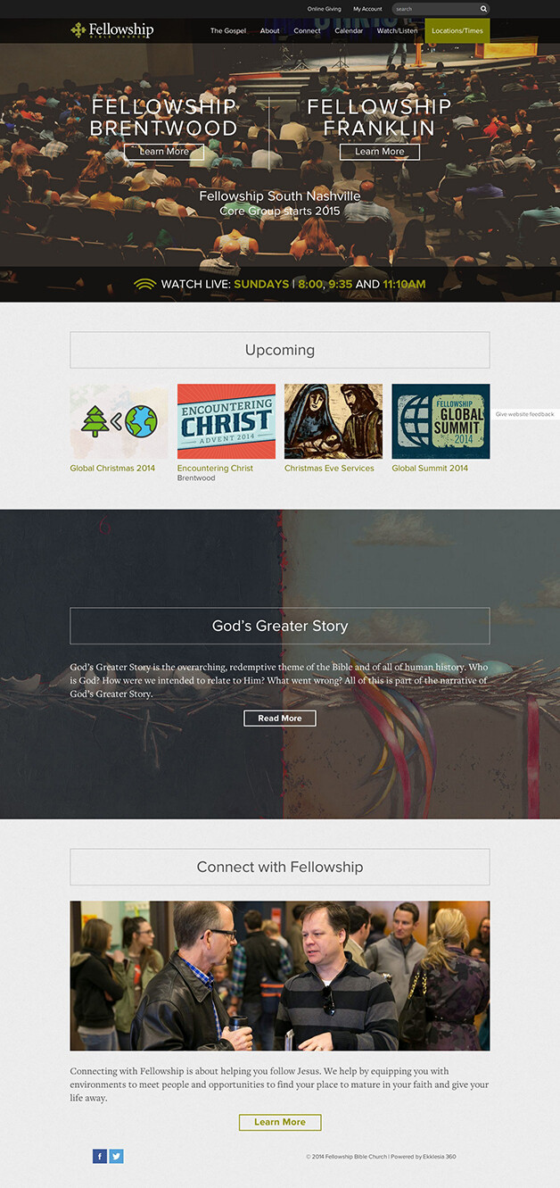
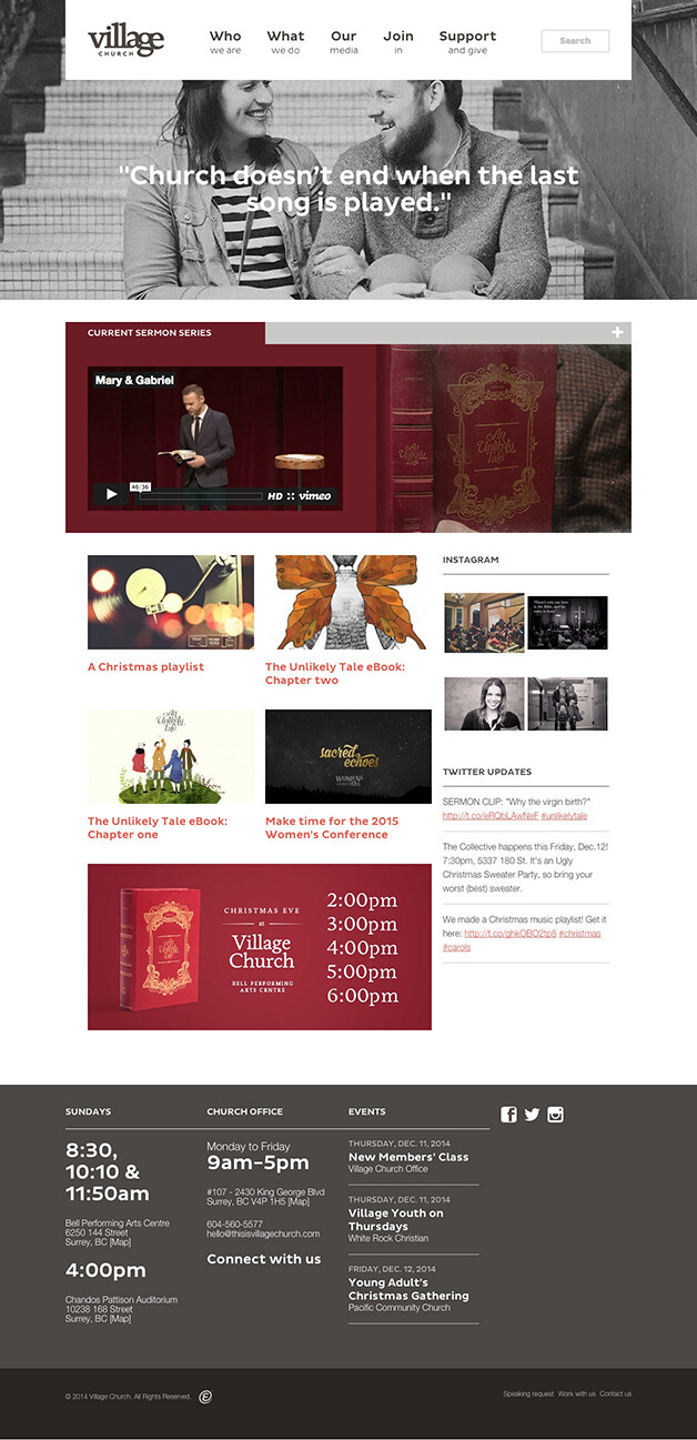
In 2014 we saw a number of amazing website designs that not only looked good but captured the church's ministry process. Below you’ll find some of the best church website designs of 2014. These are all sites that help people get connect to the church. We've highlighted 5 to share more in depth insight about what they are doing well.
The Village Church has been a long time ministry partner. In their new site they reworked their entire approach to multi-campus logic making it easier to maintain. The site is fully responsive, with beautiful parallax design elements. Large photographs tie everything together and bring the website to life. Here are a few pages to check out Stories & their Flower Mound campus page

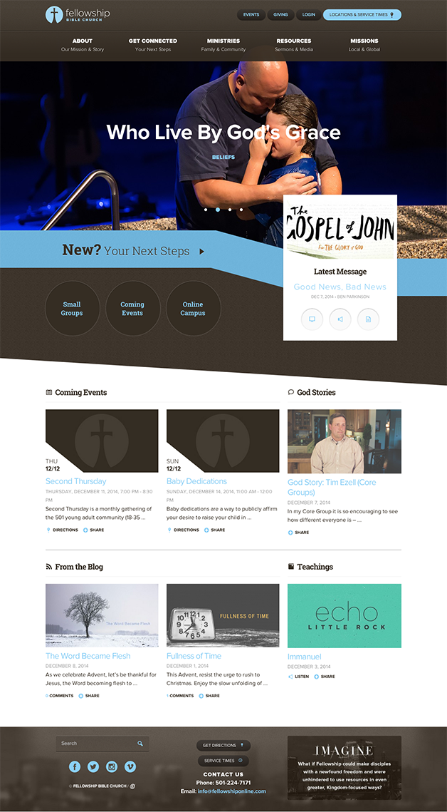
Fellowship Bible Church in Little Rock's new website merged various sites together to create a single site for their many campuses. They worked through our Content Strategy to pair down their content and highlight key areas of their church, especially on the home page that draws people to take their next steps.
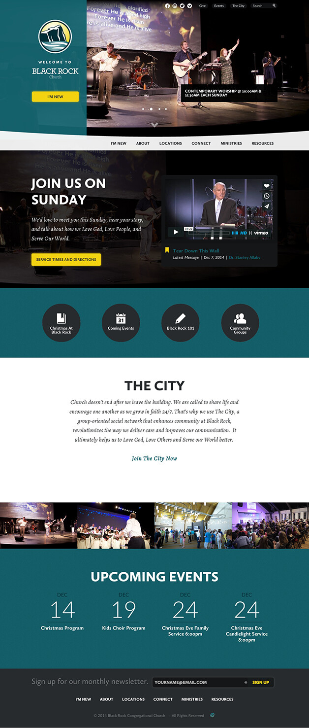
Black Rock uses their home page to help new visitors feel welcome and at the same time it directs them to deeper levels of engagement. Also on the home page is content from the City which they have integrated into their website. Another key feature of the design is clear bold call to action buttons throughout the site.
Re:Generation site serves to connect different churches across the county to local programs and provides materials for those groups. Media in the form or stories and teachings help people engage with the site.

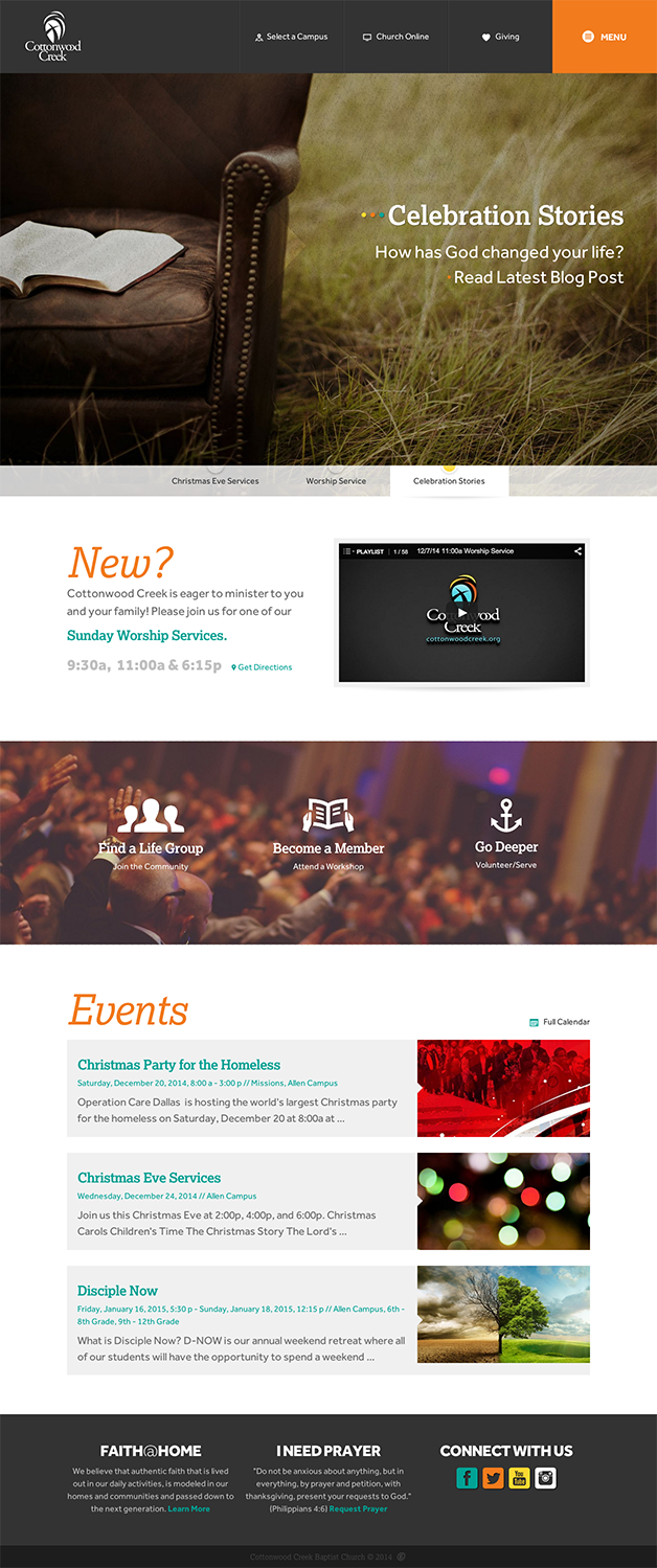
Cottonwood sought to create a site that was easier to navigate, better at presenting key values and helped people find opportunities to connect in community. What works well with this design is the vertical menu. It provides the same experience across all devices, while also providing a clear organized structure for all the content. On the homepage you’ll also see entry points for people to connect to the community.
We've brought 3 of our most popular resources together. Download this kit and learn everything you need to know to start an effective church website redesign.