Corporate HQ
Monk Development, Inc.
14488 Old Stage Road
Lenoir City, TN 37772
(877) 452-0015 Toll-Free
Support
Hours
8:00am - 5:00pm
Mon - Fri (CST)
Email
Submit a Request
Phone
1 (877) 452-0015 x2
Learn more about our support services.

Monk Development, Inc.
14488 Old Stage Road
Lenoir City, TN 37772
(877) 452-0015 Toll-Free
Hours
8:00am - 5:00pm
Mon - Fri (CST)
Email
Submit a Request
Phone
1 (877) 452-0015 x2
Learn more about our support services.

Creating content is not a content strategy. This is a hard fact to face. Even more so because churches are prolific content creators. Think about it: sermons, events, videos, study guides, class outlines, graphics, flyers, blogs, devotionals etc...
Without a strategy all of this “content” creates more noise and confuses the end user of your website. There is too much stuff visitors have to figure out and piece together. It’s often not clear how everything works or relates. In the end, you’re creating content for content’s sake.
Contrast this with a church who has a content strategy. They understand why a piece of content needs to be created and how it fits into the overall strategy. They also have a structured way to present the material so people will understand what’s being communicated.
The last point is uniquely a user-centered approach to content strategy. It's also one of the most misunderstood aspects of a content strategy.
While explaining this idea to a church, it seemed like they got it. Upon further discussion, it was clear they thought user-centered content was only about creating content the user wanted. Sometimes the message people need to hear isn’t what they want to hear. Their idea of user-centered content was off.
This content must be clear, simple and straightforward. It also needs to be displayed in an organized and defined way. When you get right down to it, user-centered content is just that, content a visitor can use.
User-centered content must be:
To illustrate, here is an example from my past life as a church communicator.
One of the mom’s, that I had known for years, was hustling her children to various youth ministries. It was obvious they were late and she was upset.
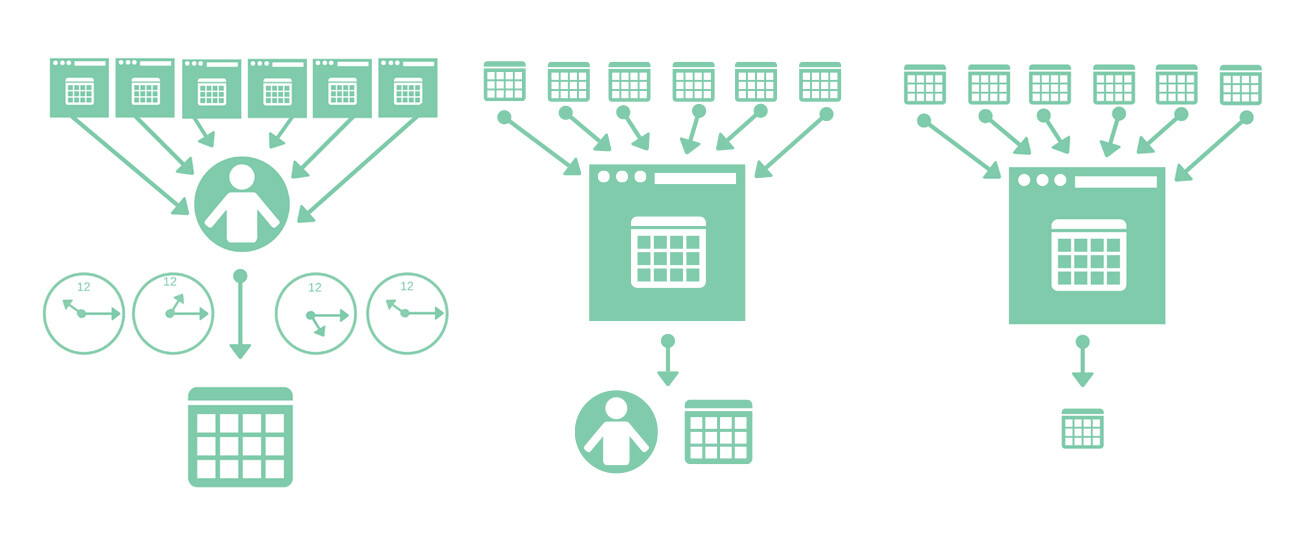
On the way back to her car I had a chance to talk with her. She shared that her three kids were active in six youth ministry programs. Each ministry had it’s own PDF calendar and they were located on six separate ministry pages. She was having trouble keeping it all straight.
She also explained how each month she spent a few hours adding events to her calendar. That she could only do it from her laptop, because the files weren’t easy-to-read on her mobile phone. She wasn’t alone, other parents were having similar problems.
After talking with more parents it was clear they desired:
The next step was defining the needs of the youth ministries.
The needs of the youth ministry where clear:
With this information it was clear what user-centered content would look like.
To help both the parents and the youth ministries we created:
While some of the requirements are technical, the other parts required a strategy. The user-centered strategy defined:
In this case the user-centered content strategy was easy to define.
If your church wants to tackle more complex content strategies, we'd love to help. We’ll work with you to define the problem, clarify what success looks like and make suggestions based on best practices we’ve developed from serving over 7,500 churches.