Corporate HQ
Monk Development, Inc.
14488 Old Stage Road
Lenoir City, TN 37772
(877) 452-0015 Toll-Free
Support
Hours
8:00am - 5:00pm
Mon - Fri (CST)
Email
Submit a Request
Phone
1 (877) 452-0015 x2
Learn more about our support services.

Monk Development, Inc.
14488 Old Stage Road
Lenoir City, TN 37772
(877) 452-0015 Toll-Free
Hours
8:00am - 5:00pm
Mon - Fri (CST)
Email
Submit a Request
Phone
1 (877) 452-0015 x2
Learn more about our support services.
Ekklesia360.com has a new website! For those counting, this is our fourth version of the website and we hope to get better with each iteration.
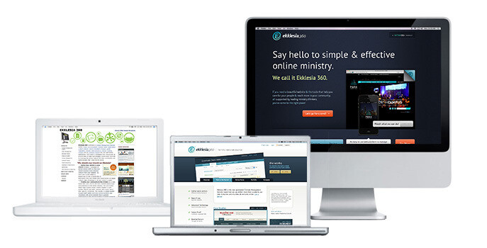
Here’s a trip down memory lane going from left to right:

2006 - Welcome to our first e360 website and the only one I (Drew Goodmanson) ever created. It’s a bit embarrassing to look at now, but this is where we started many years ago when we kicked things off. This website was very simple and the code and content was great for SEO. At the time, we were able to rank extremely high on Google for searches like “church cms” which led to people visiting and contacting us to learn more about the product.
2007 - A redesign was in order because our first site no longer reflected our brand. We hired a great designer named Mark Priestap to create a new logo and website to reflect the growth of the product and our capability. We began offering more options for visitors to view videos or sign-up for a demo for the product. With a great design and architecture, this website lasted us many years.
2011 - The end of 2011 led us to launch the third generation of our website. We felt it important to design a product site that created a more Software-as-a-Service (SAAS) experience. For this website we used Shane Thacker and designed (primarily) a one-page website, sometimes referred to as parallax. The simple design worked great for several years but began to show it’s age last year for a number of reasons, which we will explain below.
2014 - And now, drum roll please… here’s the new, fourth generation of the Ekklesia 360 product website:
There were a number of reasons we decided to redo the entire website; here are three of the main themes that led to the redesign:
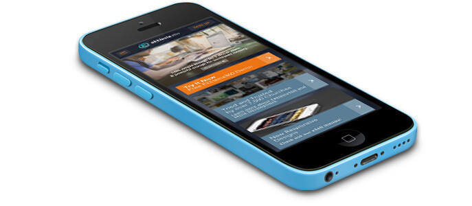
With our mobile visitors on the increase and us recommending to our clients the critical nature of being-mobile and tablet friendly, we created a responsive design. Mobile visitors increased 40% from 2012 to 2013 on Ekklesia360.com. Responsive websites in today’s world are a must. Building responsive also lets us future proof the website as new tablets and phones come on the market.

Over the years we’ve learned a lot about what people seek to determine whether Ekklesia 360 is right for them. Going through our own content strategy we were able to create different pathways based on an individual’s buying process and personas (such as Church Communicators or Church Tech people). We purged a lot of the old content and added new, relevant content based on hundreds of conversations with churches. Further, we want to show more than tell.
In the coming weeks, you will continue to see us add videos and images to make it easier to not just read about our features but also see how they are utilized.
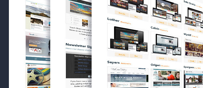
On our old site, the purchase decision was too linear toward selecting one of our themes. With this design, done by our own Jenn Craycraft, we are incorporating MonkDev into the Ekklesia website to showcase our awesome custom work and strategy offerings. We now have a stair-step product offering to meet churches where they are and demonstrate how we can grow with them. Churches can now select a ready-to-go theme, bring their own design or go with our custom options. We showcase this in our portfolio section.


In addition, a lot of the cool stuff has been added behind the scenes. We integrated several third party sales and marketing solutions to make it easy for visitors to get the content they seek. For example, smart forms allow you to not have to enter your information twice just because you want to download two resources. We are creating dynamic calls-to-actions to help us deliver the right message to the right people; gone are the days of having the same message for everyone. Our visitors are unique and our content should serve each of them in their respective areas!
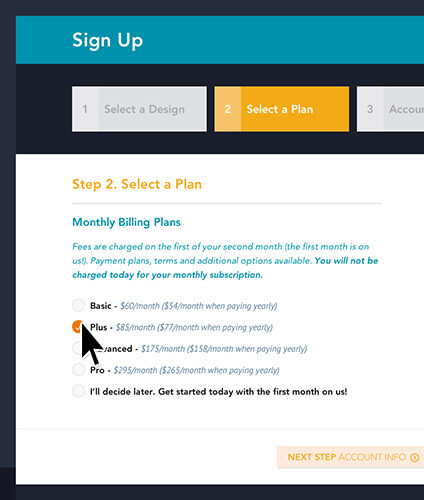
Lastly, users can now sign-up with a theme easily right from the website. If you're ready to get going, check out our easy process!