Corporate HQ
Monk Development, Inc.
14488 Old Stage Road
Lenoir City, TN 37772
(877) 452-0015 Toll-Free
Support
Hours
8:00am - 5:00pm
Mon - Fri (CST)
Email
Submit a Request
Phone
1 (877) 452-0015 x2
Learn more about our support services.

Monk Development, Inc.
14488 Old Stage Road
Lenoir City, TN 37772
(877) 452-0015 Toll-Free
Hours
8:00am - 5:00pm
Mon - Fri (CST)
Email
Submit a Request
Phone
1 (877) 452-0015 x2
Learn more about our support services.
How would your church's mobile web strategy change if everyone owned an iPhone? Start planning for that reality now. With global mobile internet usage predicted to overtake desktop use by 2014, your mobile church website strategy is more important than ever.
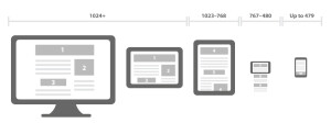
One of those strategies we use here at Monk Development is responsive design. As you'll see, responsive doesn't just encompass a mobile site. While no one, singular definition of "responsive design" exists, it is generally agreed upon that it includes three main areas:
In other words, responsive websites live on "grids" that expand and contract the elements of the website based on the type of device being used for the visit.
 MonkDev designer, Jenn Craycraft, digs in a little further, "Responsive design makes one website work seamlessly from your large desktop to your mobile device. We can set it up to work everywhere in-between (laptops, tablets, horizontal and vertical view on mobile phone). The sky is the limit."
The biggest benefit? Jenn concludes, "Responsive design gets your content seen no matter where your user is."
One of MonkDev's most recent responsive design projects was collaborating with the team at Emergence, a church located in Totowa, NJ. Scott Beatty, an implementer for Monk, explained the process with Emergence, "Their willingness to use responsive design best practices and an eye-catching clean design helped overcome common challenges." Challenges that many churches face when navigating their web presence.
I asked Scott if other churches should consider using this relatively new web technology. "Responsive design allows a church to present their complete site offering in multiple formats without the hassle of having to manage multiple sites." He continued, "For churches that want a website that works for smart phones and tablets to desktops and TV screens a responsive site from Monk is the way to go."
Responsive design is a solution that comes with many advantages. But some churches may need alternative approaches for wading into the mobile world. MonkDev has mobile-friendly options that any church, regardless of budget, can implement immediately. Here are a few examples.
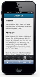
 This low-cost solution has the appearance of a high-priced custom app, but it's built in a web environment. Whatever mobile browser people are using, they'll get the same experience. Users won't be accessing the full site, however. You'll identify and display a subset of content most valuable to mobile users.
Keep in mind that your branding options won't be as expansive as some of the other mobile choices. There's also an underlying framework the site is built on, limiting the flexibility of the web app. It's a cost-effective solution for churches wanting to go mobile.
Example: Oasis LA's mobile site.
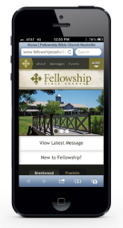
 With our tailored mobile site, you're going to have more flexibility in branding. Design-wise, it'll look visually similar to the main site. Essentially, this is a separate website that is optimized to work on mobile phones.
Similar to the web app, you're presenting your users with an intentionally curated set of content, optimizing it for mobile use. Because this is a web site, and not on an app framework, there is more flexibility with custom development.
Example: Fellowship Bible Church
 We've covered responsive design already, but there are some particulars that you should know about.
For instance, responsive design "future-proofs" your website. Right now, the iPad is the cat's pajamas, but let's say that changes. What if, in two years, we're looking at websites on the back of our hands? (Don't laugh. It's totally possible.) A website with responsive design, because it is based on grids and flexible media, doesn't care where it's being displayed. It's like water, expanding to fill the container it's placed within. (In theory, at least.) Responsive design is browser agnostic.
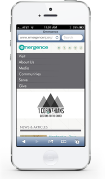
Responsive design covers all the content on your website, so there's no need to curate. You can give users access to full firehose. Side benefit of going responsive? Often times the design is created with mobile first in mind. This clarifies content goals quickly.
Example: The good folks of Emergence. If you want to take responsive out for a test drive, pull up the Emergence website and resize the browser. Mind blown yet?
Whether it's a web app, curated site, or responsive design, churches need to consider how they will answer the mobile website question. Who owns your mobile strategy?
 |
Complete this short survey: Please take a moment to complete this short six-question survey about your church mobile strategy. Plus, one lucky participant will win a $25 Amazon gift card. |
Are you a current client? Call us today at (877) 452-0015 to talk through mobile options for your website.
Not a current Monk client? Learn more about Monk's approach to mobile site strategy.